Before we jump into how to train uplift models, let’s start with understanding the metrics used by these models. The package we used for evaluation is scikit-uplift.
In general, the data for training/testing uplift models will look like this: We have a control group and treatment group. In this case the two groups contain same number of users.
For the two groups, we assume that users in the treatment group have been given treatment like showing some ads while the users in the control group have not. For each user we would assign a label. For example, suppose we show treatment users some ads, and we want them to buy more. The label here is whether the user is converted (i.e. buy something.)
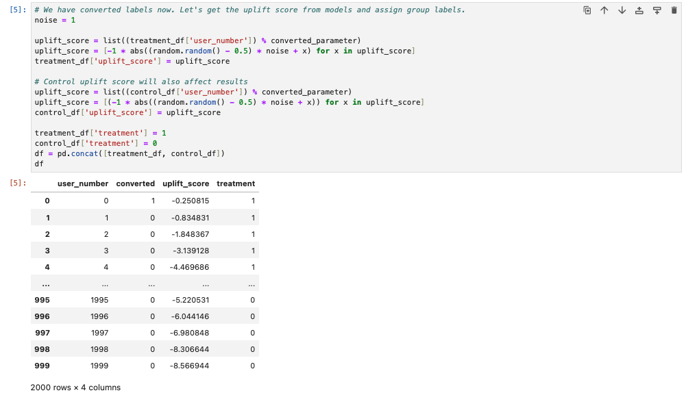
In the notebook, we assign the converted label based on the user number. If the user is in the treatment group, users having user_number % converted_param = 0 would be assigned converted label. Here converted_param is a parameter used to control how many users are converted.
If the user is in the control group, we would apply an additional randomization to control how many control users are converted. In the notebook, we could see that the conversion rate for the treatment group is ~10% and ~5% for the control group.
Next, we have an uplift model to predict the uplift scores for our users. Here the score is assigned based with the following equation where noise is a scalar controlling the model performance. This assignment seems pretty close to the ground truth.
uplift_score = -| (user_number % converted_parameter) + (random.random() - 0.5) * noise |
Finally, to evaluate our models, we would run some metrics like AUC, blablabla@k. 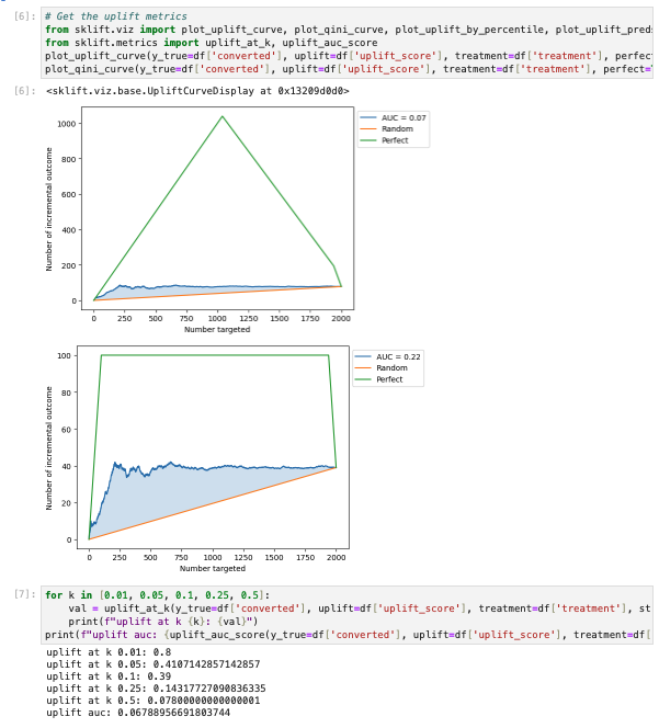
In the following sections, we would introduce each metric and how they are computed.
Uplift at K
The users (in both control and treatment) would be sorted based on the assigned uplift scores. If K = 0.01, it would mean we compare the top 1% of users in treatment and control and compute the uplift. We get uplift at K with the following equation:
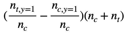
The notation in the above equation is following the link. n_{t, y=1} means the number of users who are converted in the top 1% treatment cohort and n_t is the number of users in the top 1% treatment cohort. However, how to select the users could be tricky. It could be top 1% users from treatment and control respectively. Or, it could be top 1% of users from the all users. If we select top 1% users from treatment and control respectively, n_t and n_c should be the same if the number of the numbers of all users in treatment and control are similar, which is N_t = N_c. On the other hand, this might not be true if the top 1% of users are selected from all users.
By tracing the source code of the scikit-uplift computing the metric, we could see the package provide both of them. If strategy is overall, the metric is computed with top 1% of users from the all users.
In the notebook, we use the overall strategy and the numbers are as follows and therefore the uplift@0.01 is 0.8.
n_{t, y=1} = 10
n_t = 10
n_{c, y = 1} = 2
n_c = 10
Qini Curve
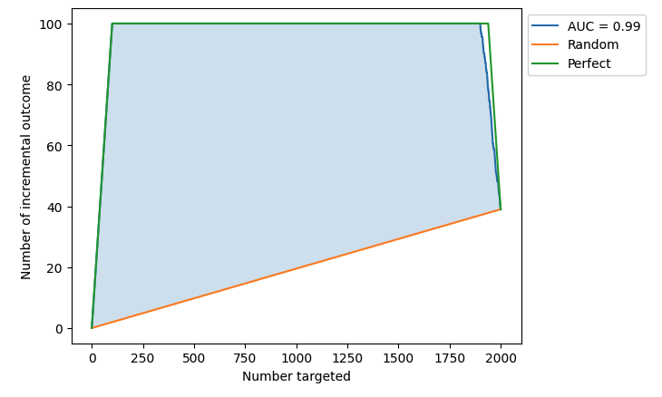
If we want an overall estimate of the uplift model, one of the most common evaluation metric is through Qini curve. With the Qini curve, we plot the uplifts of targeting different number of users and compute the area under curve to get the overall evaluation on the model. The below is the notebook’s Qini curve.
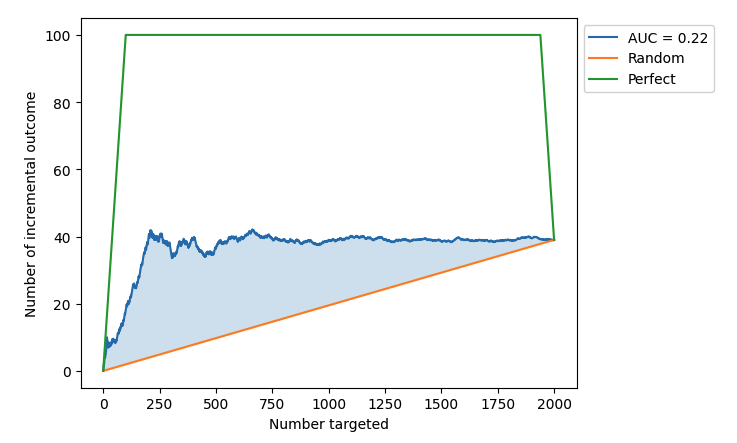
There are three curves in the plot: random selection curve (orange), model performance curve (blue) and perfect performance curve (green.) The overall estimate we are looking for is area under Qini curve (AUQC). Since it’s evaluating the uplift performance, the computed AUQC is computed by AUC(model performance) - AUC(random performance). One thing to note here is that in the scikit-lift package also considers the AUQC of perfect performance. See how it’s computed in the AUQC documentation.
Next we are diving into how we obtain the three curves.
Random Performance
From the source code we could see the baseline curve is a straight line. The performance is computed with:
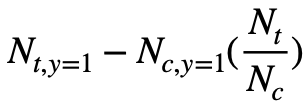
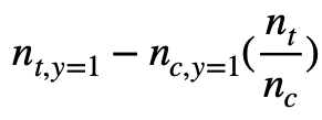
N_{t, y=1} is the number of users converted in treatment group. The N_{c, y=1} is the number of users converted in control group. The uplift is the difference between the two while N_{c, y=1} is scaled by the number of users in each group. If the number of users are the same, N_t/N_c would be 1. Since it’s a random model, it is hypothesized that the uplift would be distributed evenly among users, and therefore it is a straight line from (0, 0) to the final uplift after targeting all users (N_t + N_c, N_{t, y=1} - N_{c, y=1} * N_t/N_c ).
Note: If there are lots of sleeping dogs, the slope of the line would be negative.
Perfect Performance
From the source code, we could see that the perfect performance curve is first computing the perfect uplift score given the conversion label and the treatment label (indicating users are in the treatment or control group.) The users are ranked by the perfect uplift scores, and we compute the uplift by targeting different number of users.
Here, the number of targeted users is obtained by considering all users instead of each group. That is, the targeted users might not contain control or treatment users.
By inspecting the perfect uplift score computation, y_true * treatment - y_true * (1 - treatment), we could see that the users are ranked in the following order:
- Treatment users with converted label 1
- Treatment users with converted label 0 or Control users with converted label 0
- Control users with converted label 1
For each targeted user number, the Qini curve is computed with the following equation:
It is computed with the following code
curve_values = y_trmnt - y_ctrl * np.divide(num_trmnt, num_ctrl, out=np.zeros_like(num_trmnt), where=num_ctrl != 0)
Comparing it with the one used in random performance, we could see that the only difference is the first part now is not a constant and is dependent of the assigned uplift score.
Let’s deep into what happens in each section of the perfect performance curve.
Section 1: Treatment users with converted label 1
In the first part of the curve, it consists of treatment users with converted label 1. In the notebook, it is the section of targeting 0 ~ 100 users. Since we don’t have any control users, the equation becomes n_{t, y=1} and it is equivalent to n_t. This is the reason why it is a line with slope 1.
Section 2: Treatment users with converted label 0 or Control users with converted label 0
In this section, the targeted users includes the ones that are not converted, no matter they are in the treatment or control group. In the notebook, it is the section of targeting 101 ~ 1939 users. The equation becomes N_{t, y=1} - 0 * (n_t/n_c) and equals to N_{t, y=1}. Since for now we have included all converted users in the treatment group while not include any converted users in the control group, the second part of the equation is always 0 and the first part is a constant. That is the reason why the second part is a horizontal line with y = N_{t, y=1}.
Section 3: Control users with converted label 1
In this section, the targeted users includes the converted users in the control group. In the notebook, it is the section of targeting 1940 ~ 2000 users. The equation becomes the following:
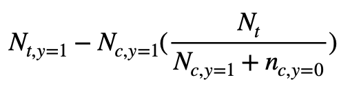
We could see that it is definitely not a straight line since the variable is in the second part’s denominator. However, the straight line is a loose upper bound and should still be valid. Therefore, the AUQC obtained with the perfect performance should still be valid.
Model performance
The Qini curve for the model performance is obtained similarly as the one obtained for the perfect performance with the following equation:
From the Qini curve below, we could see the AUQC is 0.22. The reason that it is not high is that our uplift scores assigned to the control users are putting converted control users at the top of the list. In order to get the best uplift, we should put them at the bottom of the list.
If we add a negative sign to the score assignment of the control users and subtract it by 1000 ( to keep it in the same numerical range), we would obtain the formula below.
uplift_score = | (user_number % converted_parameter) + (random.random() - 0.5) * noise | - 1000
With this formula for control users, the AUQC is much better which is 0.99.
Uplift Curve
The above is how we plot the Qini curve. Another evaluation is uplift curve, and it is very similar to Qini curve while the evaluation is done with the following equation: